Seattle SuperSonics — A Rebrand Case Study
The Seattle SuperSonics played in the NBA from 1967 until 2008, when an ownership dispute sent the franchise to Oklahoma City to become the Thunder — over the fan base’s objection, and without the team ever actually losing its place in the city. Seattle was left without an NBA team, and its history with one of the league’s original West Coast franchises unresolved.
The opening came a decade later: the NHL’s December 2018 announcement of an expansion team in Seattle, tied to a new multipurpose arena — the exact kind of facility whose absence had been part of why the SuperSonics left in the first place. With NBA marketing circles already speculating about what a returning Seattle franchise might look like, this thesis set out to answer that question directly: how might the history of sports-franchise rebranding, combined with contemporary branding and marketing methodology, be used to rebuild the SuperSonics’ identity in a way that renews the fan base’s devotion rather than just giving an old logo a face-lift?
Research. The project treated other teams’ rebrands as data, not just inspiration. An anthropological study of the Atlanta Hawks’ rebrand — weak online presence, poor fan experience, thin connection to the current team — became the model: Atlanta leaned on its history and target-demographic research rather than a cosmetic update, and saw TV ratings up 120%, social engagement up 394%, online retail up 124%, and attendance up 22% as a result. Interviews with Megan Ryan (VP of Marketing, Denver Nuggets) and Jeb Brant (Digital Video Coordinator, Kroenke Sports & Entertainment) shaped two decisions directly: basing the new mark on the SuperSonics logo era fans already identify with most — rather than designing something new from scratch — and building the campaign around short-form motion graphics, which Kroenke’s own analytics showed consistently out-performed every other form of social content. The target demographic — men 25–35, old enough to remember the team leaving and most likely to be vocal about wanting it back — informed both the visual tone and the “homecoming” framing of the whole campaign.
Identity. Research into resale and secondhand apparel (Fanatics, NBAstore) showed the SuperSonics’ 1970s skyline logo as the clear best-seller among the team’s many eras, confirmed by a 5,000-fan poll on Fanjuicer.com ranking it among the most beloved in NBA history — so that logo became the foundation rather than a clean-slate redesign. The finished primary mark reworks it as a badge, closer to an MLS crest than the traditional NBA roundel (Seattle also tests as one of the best soccer markets in the country, with a demographic overlap worth building on) — the city skyline anchored by the Space Needle, with a supersonic jet breaking through the third dimensional plane of the badge itself. A secondary mark reads two ways: half a basketball, or the view from a cockpit banking into downtown Seattle. Forest Green (Pantone 2465C) carries the weight of the franchise’s history and roots in the city; Sun Yellow (Pantone 102C) stands in for the new beginning the rebrand represents. Skinny Sunbeams, a tall, slim display face, was chosen for its nod to Seattle’s still-prevalent indie culture; Trade Gothic Condensed carries the supporting type.
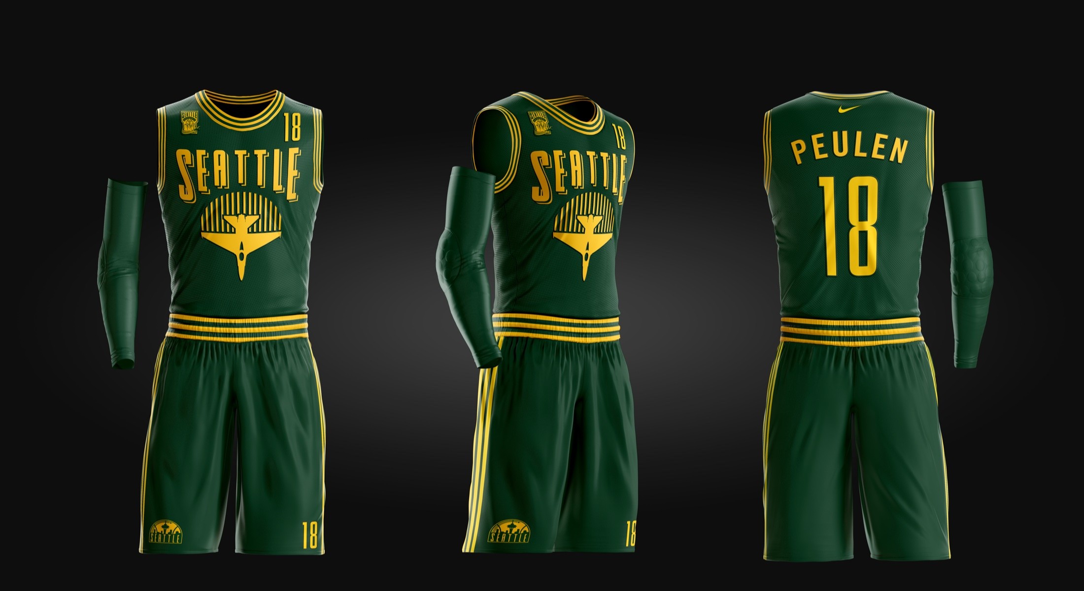
Jersey & motion. The identity extends into a full home jersey — designed, per the brief, to represent the brand as cleanly as possible rather than chase a flashy one-off — and into a set of “Welcome Home Seattle” motion bumps built specifically for Instagram, Facebook, and Twitter: a color vortex resolving into the primary mark, the skyline building up from the bottom of frame, the jet sweeping through to close each spot. The bumps were the intended centerpiece of the launch campaign, backed by the same brand and process documentation shown here.
Brand Identity
The finished mark, installed as vinyl for the thesis defense — a badge-shaped primary logo (leaning on the MLS Sounders' badge convention rather than the NBA's usual crest) built around the Seattle skyline and a supersonic jet breaking the picture plane.
Jersey System
Home uniform built to carry the identity as cleanly as possible — the wordmark, the jet-and-rays secondary mark, and the Forest Green / Sun Yellow palette applied the way a real Nike template would ship it.
Storyboards
Shot-by-shot boards for the "Welcome Home Seattle" motion bumps — a vortex reveal into the primary mark, the skyline building up from the bottom of frame, the jet sweeping through to close each spot.
Motion
The finished "Welcome Home Seattle" bumps, cut for Instagram, Facebook, and Twitter — logo reveals built to run as the campaign's centerpiece, the same role motion graphics play for every Kroenke Sports property this thesis studied.